How to center elements on the last row in CSS Grid?
If you are looking for a quick answer to center elements in the last row of CSS Grid, use the codepen below.
Getting here wasn’t a straight forward process. Read below if you want to learn in depth how this code works, how to expand this solution and how I got here.
See the Pen Untitled by Koala Widgets (@koalawidgets) on CodePen.
Defining the desired layout
For a while, I’ve been searching for a flexible layout that meets these criteria:
- The elements should have a flexible width
- The last row should be centered
- It should be easy to edit, so it’s a copy/paste process to use in other projects
- All the elements should have the same width
- All the elements in the same row should have the same height
- The number of columns should change automatically, according to the screen width
- The solution should work for any number of elements
- There should be a gap between the elements
- The solution should be achievable with CSS. Meaning, no Javascript.
- The elements should use the full width of the wrapper
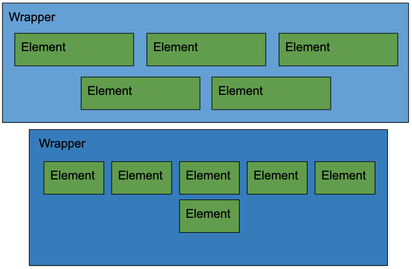
The right time to find a solution to center the last row elements in a grid using CSS
In the past, I settled for solutions that don’t meet all my criteria, however, with the current state of CSS, I thought it must be possible.
There is Hope
My CSS mentor Kevin Powell recently did a live YouTube responsive layouts workshop. If there is someone who knows how to achieve this, that is Kev.
At some point in the video 1:50:55, Kev had a grid on his screen and somebody asked to center the last row elements.
His response was both dissapointing and hopeful; “That’s something I wouldn’t be able to do with grid… I wouldn’t use grid, in that case I would use flexbox“.
This got me started on a quest to find a solution using flexbox.
The YOOTheme approach that works
Since we are using the page builder YOOTheme Pro in this website, we can easily use the editor to add a Grid, and configure the settings to achieve the desired result.
Title
Lorem ipsum dolor sit amet
Title
Lorem ipsum dolor sit amet.
Longer.
Title
Lorem ipsum dolor sit amet
Title
Lorem ipsum dolor sit amet
Title
Lorem ipsum dolor sit amet
Title
Lorem ipsum dolor sit amet
Title
Lorem ipsum dolor sit amet
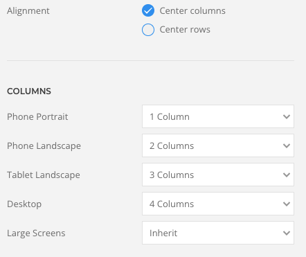
At first sight, this grid meets all the criteria, so let’s start by looking at the source code. You are welcome to inspect it in your browser as well.
This is the HTML when there are 4 columns showing.
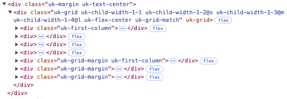
The main code to achieve this is a simple flexbox that justifies the content in the centre.
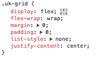
Flexbox is also allowing all the items in the same row to have the same height.
Then, they use percentages to control the column width based on the screen size, so there is a fair bit of code behind this, which is totally fine.
Also, for the gap between the elements, they are using a left padding on the elements, and a negative padding on the wrapper, to even out the first element of each row.

In conclusion, this is a good approach and I would just need to define the number of columns according to the screen width as I did in the settings of YOOTheme Pro.
However, it is not as portable as I would like, because I would need to pre-define break points for the media queries, which may be different in other projects.
Also, telling the number of columns in various screen sizes, is not as elegant as simply defining the minimun size of the items.
So, here’s my quest to find such solution:
Looking for a simpler flexbox solution to center elements in the last row
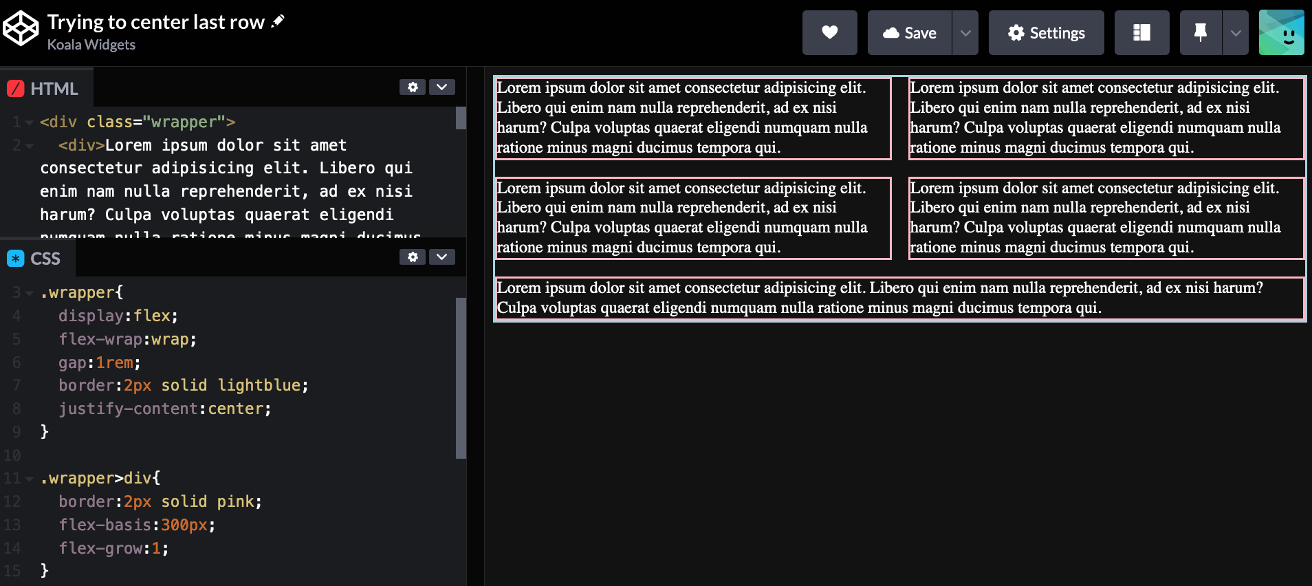
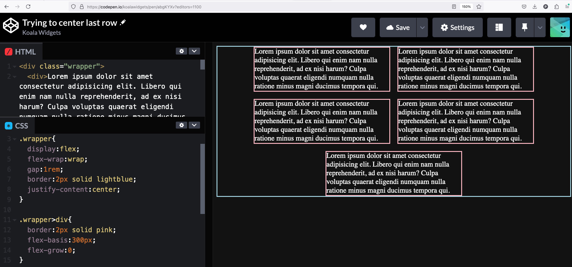
Using flexbox by default almost worked perfectly, except for the last column, that stretched the item to take the full width of the row.
The solution for this is simple, just use
1 | flex-grow:0; |
Exploring Grid
Luckily, I came across the article Controlling Leftover Grid Items with Pseudo-selectors where the author finds a solution to center elements in the last row of grid.
This is a very clever solution, just assign 2 cells to every item, then move the item in the last row to the desired position.
Centering the elements
2 Column Layouts
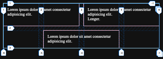
In the image above, the last item is targetted in CSS, by selecting the last element, that is also an odd number. Keep in mind, that another way to say “odd numbers” is by selecting the multiples of 2, then adding a unit to it: 2n + 1.
Then, we just tell this item to end in line #4. As you can see in the image, lines are placed at the beginning at the end and at the gaps.
1 2 3 | .item:last-child:nth-child(2n + 1){ grid-column-end:4; } |
3 Column Layouts

1 2 3 | .item:last-child:nth-child(3n + 1){ grid-column-end: 5; } |
When there are 2 item in the last row, we need to select the second last element that also follows the sequence 4, 7, 10, 13… And tell it to finish in line #4.

1 2 3 | .item:nth-last-child(2):nth-child(3n + 1){ grid-column-end: 4; } |
Then, the actual last item will be automatically placed in the right spot as it remains next to the second last.
Determining the number of columns
So let’s start by defining a couple of variables:
- Item width
- Grid gap
1 2 3 4 | :root{ --min-width:200px; --grid-gap:20px; } |
1 2 3 | .item{ grid-column: span 2; } |
1 2 3 4 5 6 7 8 9 10 11 12 13 14 15 16 17 18 19 20 21 22 | .wrapper{ display: grid; grid-gap: var(--grid-gap); /* Defining the columns */ grid-template-columns: repeat( auto-fit, minmax( min( calc((var(--min-width) - var(--grid-gap))/2), calc((100% - var(--grid-gap)) / 2) ), 1fr ) ); /* Setting up the container for the queries */ container: grid-wrapper / inline-size; /* Optional */ max-width:calc(var(--min-width)*6 + var(--grid-gap)*5); } |
To understand what we are doing here, I’m assuming that you understand how display:grid; works, so the display and grid-gap attributes should be self-explanatory. If not, you can check these great videos on Grid.
The tricky line to understand is grid-template-columns. We are using repeat to define the columns. Repeat has 2 arguments:
1 2 3 4 | grid-template-columns: repeat( auto-fit, minmax(...) ); |
The first argument defines the number of times that the track list should be repeated. We’ve used auto-fit in this case which automatically adjust the number of repetitions to the largest possible number that doesn’t cause the grid to overflow.
The second argument is using a minmax() function, where we define the minimum and maximum width of our columns, but remember, our items occupy 2 columns + a gap.
The math behind the width of the columns
Let’s start by explaining the first argument of the minmax(), which defines the minimum width.
Do you remember we defined the min-width of the elements as a variable? Let’s use the defined values as examples for our grid.
1 | calc((var(--min-width) - var(--grid-gap))/2) |
But, what if the user is using a super narrow phone? Well, in that case, we want the minimum width of the item to be 100% to prevent horizontal scrolling. Since the item is occupying 2 columns, we get: X% + 20px + X% = 100%, which explains the following calculation:
1 | calc((100% - var(--grid-gap)) / 2)<br /> |
Now, we put those two calculations as arguments inside the function min(), which will automatically select the smallest of the two, and that’s the first argument of our minmax().
1 2 3 4 | min( calc((var(--min-width) - var(--grid-gap))/2), calc((100% - var(--grid-gap)) / 2) ) |
The second argument of our minmax() is the maximum widht, which we’ve defined as 1fr, which represents a “fraction” of the available space in the grid container.
A solution ahead of its time
Now, it’s time to use container queries to determine the number of columns. Let’s start with 2 column layouts.
1 2 3 4 5 6 7 | /* 2 Column Layouts */ @container grid-wrapper (min-width: calc(var(--min-width)*2 + var(--grid-gap))) and (max-width: calc(var(--min-width)*3 + var(--grid-gap)*2)) { /* Dealing with 1 orphan item */ .item:last-child:nth-child(2n + 1){ grid-column-end: 4; } } |
In this container query, we are targetting a min-width that just allows for 2 items to display side by side, and a max-width just before 3 items are displayed in the same row.
Unfortunately, CSS variables don’t work in media queries or container queries, so the code you just saw above won’t work. For now, I have to manually edit this to give fixed values that match our variables var(–min-width) and var(–grid-gap).
Having said that. I’m writing for example 200px*2 instead of 400px, so it’s quick to replace.
1 2 3 4 5 6 7 | /* 2 Column Layouts */ @container grid-wrapper (min-width: calc(200px*2 + 20px)) and (max-width: calc(200px*3 + 20px*2)) { /* Dealing with 1 orphan item */ .item:last-child:nth-child(2n + 1){ grid-column-end: 4; } } |
Final details
1 2 | /* Optional */ max-width:calc(var(--min-width)*6 + var(--grid-gap)*5); |
A future ready solution
1 | last-row:center; |
The final solution to center elements on the last row in CSS Grid
See the Pen Centering last row with CSS Grid by Koala Widgets (@koalawidgets) on CodePen.
